Bootstrap 4 Vertical Menu

Updated: An earlier draft of the post was for v4.0.0-alpha.4. A reader pointed out that the demo no longer worked with the latest update. The following example uses the current alpha release and is actually simpler and uses more native Bootstrap components.*
I know that Bootstrap 4.0 is only an alpha release, but as the Vertical Menu for Bootstrap 3 is pretty frequently visited, I thought I’d get started on the a Bootstrap 4 version.
For this example, I’m using Bootstrap v4.0.0-alpha.6. If you happen to notice anything not working, please comment and let me know and I’ll try to keep up with the Bootstrap releases.
For the demo, I’m going to attempt to keep the original html as close as I can to the Bootstrap examples listed in their documentation page. For the basic page layout, I used starter template found on the introduction page. From there I create a basic two column layout and added the example html for a Vertical nav. That gives us a very basic starter layout.
Now for just a couple small changes:
- I added a wrapping <div> around the entire nav. The wrapping <div> has the class
bootstrap-vertical-nav. - Added a link in the header to the bootstrap-vertical-menu.css file.
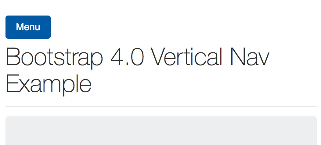
- A button was added to toggle the collapsable object.
- A <div> was placed around the vertical nav with the
collapseclass. - Lastly, I added a little extra CSS just to make it look pretty — but not necessary for functionality.
So, here’s the basic layout for the example.
<!DOCTYPE html>
<html lang="en">
<head>
<!-- Required meta tags always come first -->
<meta charset="utf-8">
<meta name="viewport" content="width=device-width, initial-scale=1, shrink-to-fit=no">
<meta http-equiv="x-ua-compatible" content="ie=edge">
<title>Bootstrap 4 - Vertical Menu Example</title>
<!-- Bootstrap CSS -->
<link rel="stylesheet" href="css/bootstrap.min.css">
<!-- Bootstrap Vertical Nav -->
<link rel="stylesheet" href="css/bootstrap-vertical-menu.css">
<style type="text/css">
body {
font-family: "Helvetica Neue", Helvetica, Arial, sans-serif;
padding: 50px 0;
}
h1 {
font-weight: 200;
}
@media (min-width: 768px) {
.bootstrap-vertical-nav {
margin-top: 50px;
}
}
</style>
</head>
<body>
<div class="container">
<div class="row">
<div class="col-md-4 col-lg-3">
<div class="bootstrap-vertical-nav">
<button class="btn btn-primary hidden-md-up" type="button" data-toggle="collapse" data-target="#collapseExample" aria-expanded="false" aria-controls="collapseExample">
<span class="">Menu</span>
</button>
<div class="collapse" id="collapseExample">
<ul class="nav flex-column" id="exCollapsingNavbar3">
<li class="nav-item">
<a class="nav-link active" href="#">Active</a>
</li>
<li class="nav-item">
<a class="nav-link" href="#">Link</a>
</li>
<li class="nav-item">
<a class="nav-link" href="#">Link</a>
</li>
<li class="nav-item">
<a class="nav-link disabled" href="#">Disabled</a>
</li>
</ul>
</div>
</div>
</div>
<div class="col-md-8 col-lg-9">
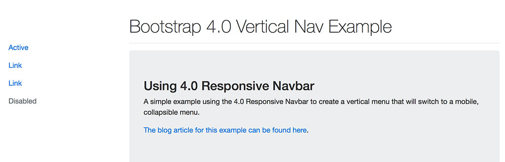
<h1>Bootstrap 4.0 Vertical Nav Example</h1>
<hr />
<div class="jumbotron">
<h3>Using 4.0 Responsive Navbar</h3>
<p>A simple example using the 4.0 Responsive Navbar to create a vertical menu that will switch to a mobile, collapsible menu.</p>
<p><a href="https://jonathan.jonathanbriehl.com/2015/12/15/bootstrap-4-vertical-menu/" target="_blank">The blog article for this example can be found here</a>.</p>
</div>
<hr />
<p>Nullam congue, dui luctus aliquam maximus, erat magna posuere purus, posuere elementum urna nisi vitae dolor. Integer tristique non velit ut suscipit. Vestibulum quam eros, blandit dapibus iaculis nec, volutpat vel purus. Quisque commodo euismod ipsum, quis pulvinar augue. Cras non fermentum velit. Proin tincidunt lectus diam, at ornare augue interdum eget. Vivamus porttitor iaculis urna in porttitor. Maecenas auctor ac augue convallis eleifend. Praesent lacus odio, placerat sed felis ac, vulputate auctor quam. Cras in nulla eu libero cursus cursus ut a enim. Praesent varius viverra maximus. Morbi accumsan, orci quis semper tempus, leo ipsum efficitur ipsum, eu fermentum ipsum est ac nibh. Ut ut venenatis eros. Duis neque nulla, malesuada non ultrices non, laoreet nec enim. Mauris congue, ipsum non ultrices congue, leo eros tristique urna, bibendum accumsan ligula sem in justo.</p>
</div>
</div>
</div>
<!-- jQuery first, then Bootstrap JS. -->
<script src="https://ajax.googleapis.com/ajax/libs/jquery/2.1.4/jquery.min.js"></script>
<script src="js/bootstrap.min.js"></script>
</body>
</html>
Contents of the bootstrap-vertical-menu.css file:
/* Creates a vertical nav starting at 768px (sm) */
@media (min-width: 768px) {
    .bootstrap-vertical-nav .collapse {
        display: block;
    }
}
That’s really it. I know it’s not pretty and it doesn’t address dropdowns, but those will come in future updates. For now, please let me know if you have any improvements or questions.